The Appeal of Colour
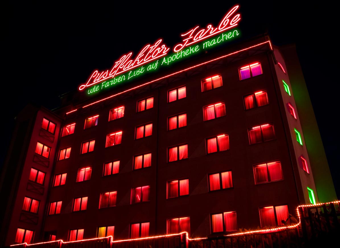
The Appeal of Colour
How colour can make pharmacies more appealing
In 2014, I was invited to Mallorca as a speaker at the Management Congress, where I gave two lectures on colour and design and on how they can create an “appetite for pharmacy”, in keeping with the event’s motto.
Although the subject discussed here concerns the use of colour in pharmacies, it can of course be applied to any other design task. Colours carry messages and create moods.
Beware of the “Lady in Red”
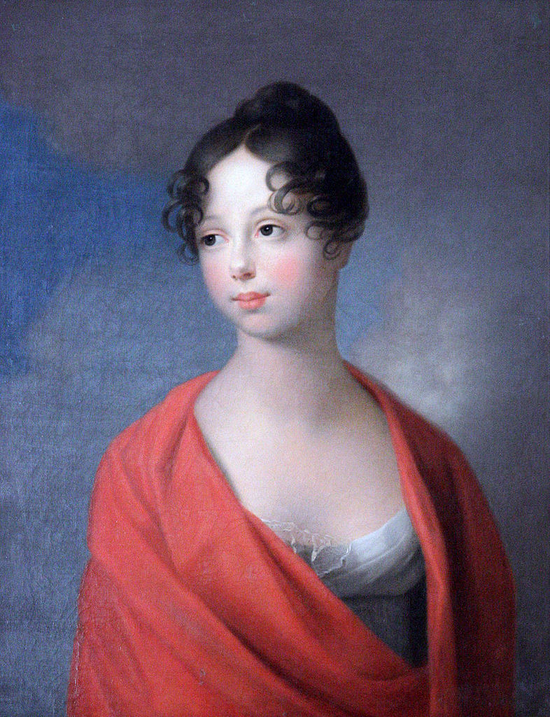
Woman in red, Catherine of Russia
According to a University of Rochester study, women wearing red are perceived as being particularly sexually active. Apparently, men interpret red on women as a signal of sexual interest. Consequently, women dressed in red are less likely to be introduced to one’s partner.
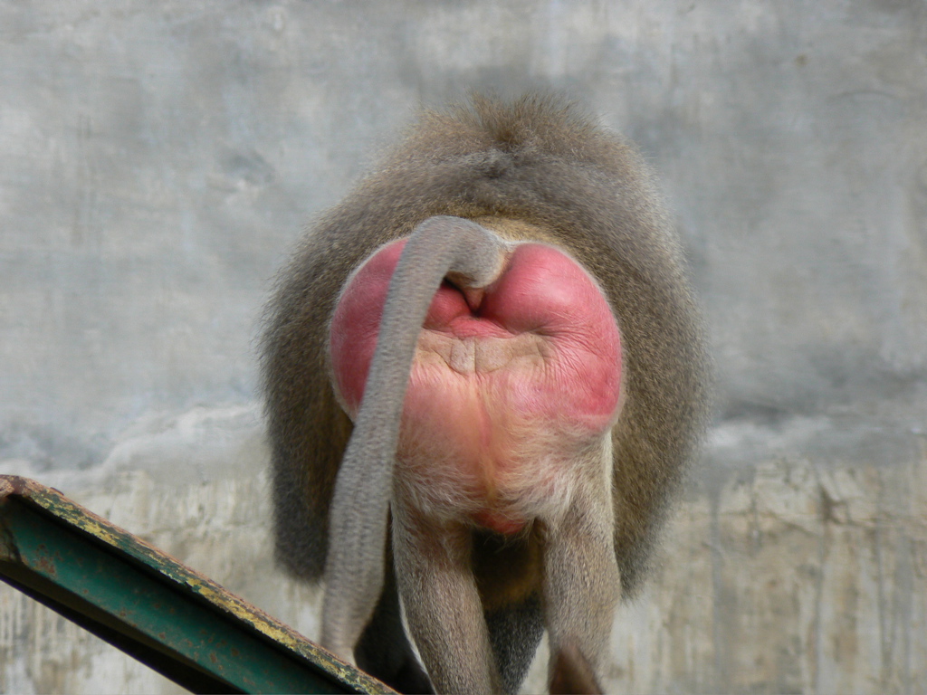
A French study also found that men tipped a waitress wearing red around 15 to 26 per cent more generously than waitresses wearing other colours.

Sóller, Mallorca
Desire
… according to Wikipedia, an intensely pleasurable form of experience.
As already mentioned, colours can convey a message and therefore increase the desirability of an object. A fillet is already something special, but cooked until delicately pink it makes one’s mouth water. Unless one is vegetarian, of course. In that case, perhaps a colourful salad would be more appropriate.
But what is colour?
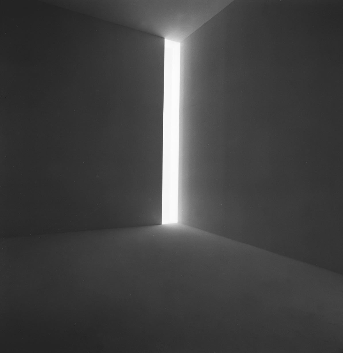
Light – shadow and the power of transformation. Light lives through darkness, darkness through light. Manfred Hinrich
First of all, it is the surprisingly small part of the electromagnetic spectrum that we perceive as light.
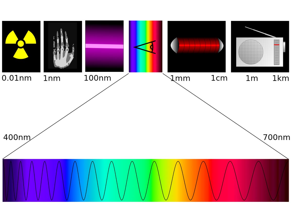
The much larger remainder may be invisible to us, but it still has a considerable influence on our well-being. Taking this idea of “invisible” vibrations further, I am firmly convinced that rooms and places can radiate positive or negative energies that designers can influence and create.
A photograph therefore tells only half the truth. Rooms have to be experienced.
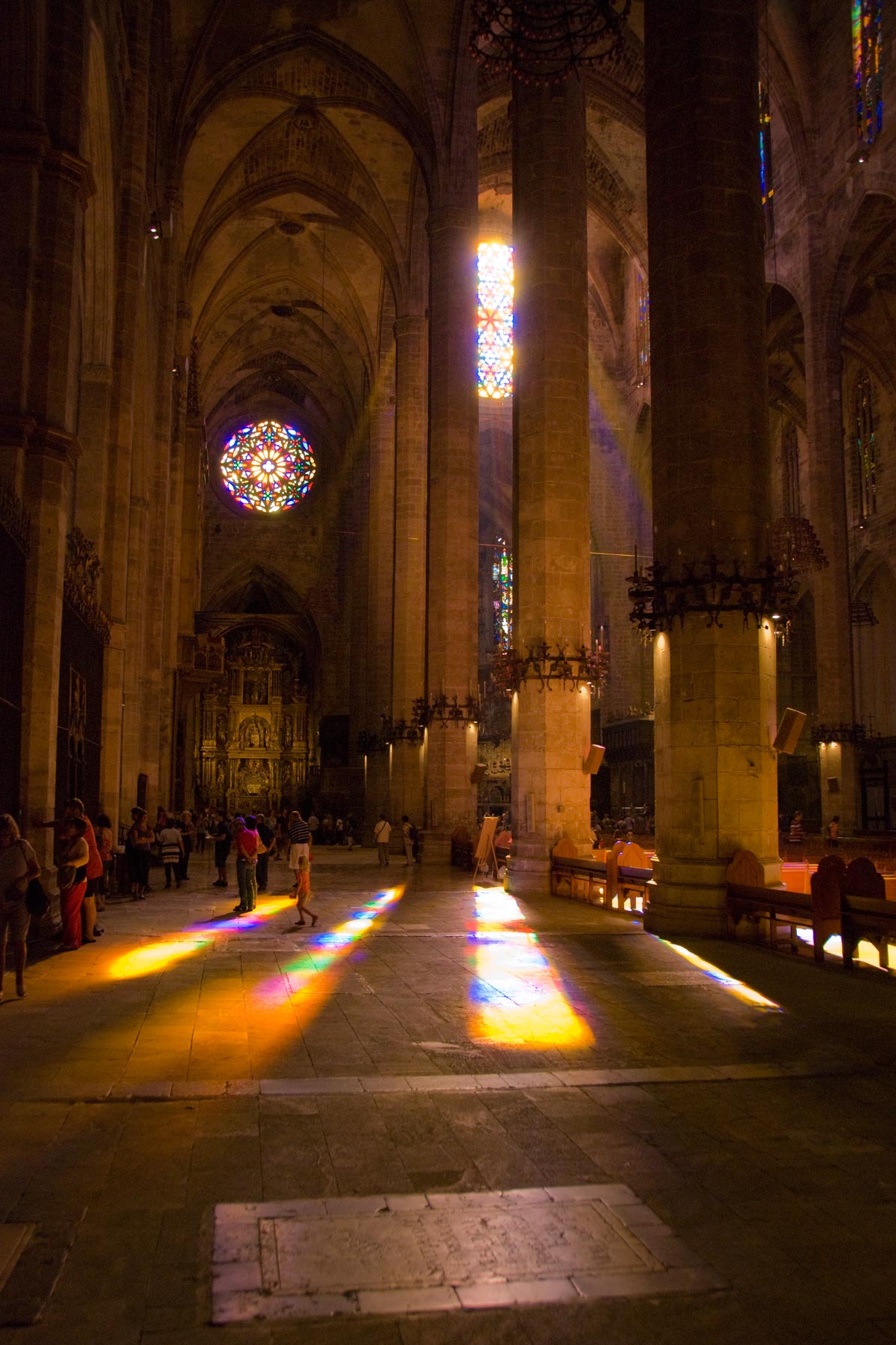
Cathedral of Saint Mary, Palma de Mallorca
During the Gothic period, when buildings became more delicate and windows increasingly large, the idea of the metaphysics of light played an important role: God was regarded as the original source of light, filling all matter and bringing it into existence. Stained-glass windows were used in an attempt to represent this divine light.
The meaning of colour and contrasts
Because cold and warm cannot be imagined without one another …
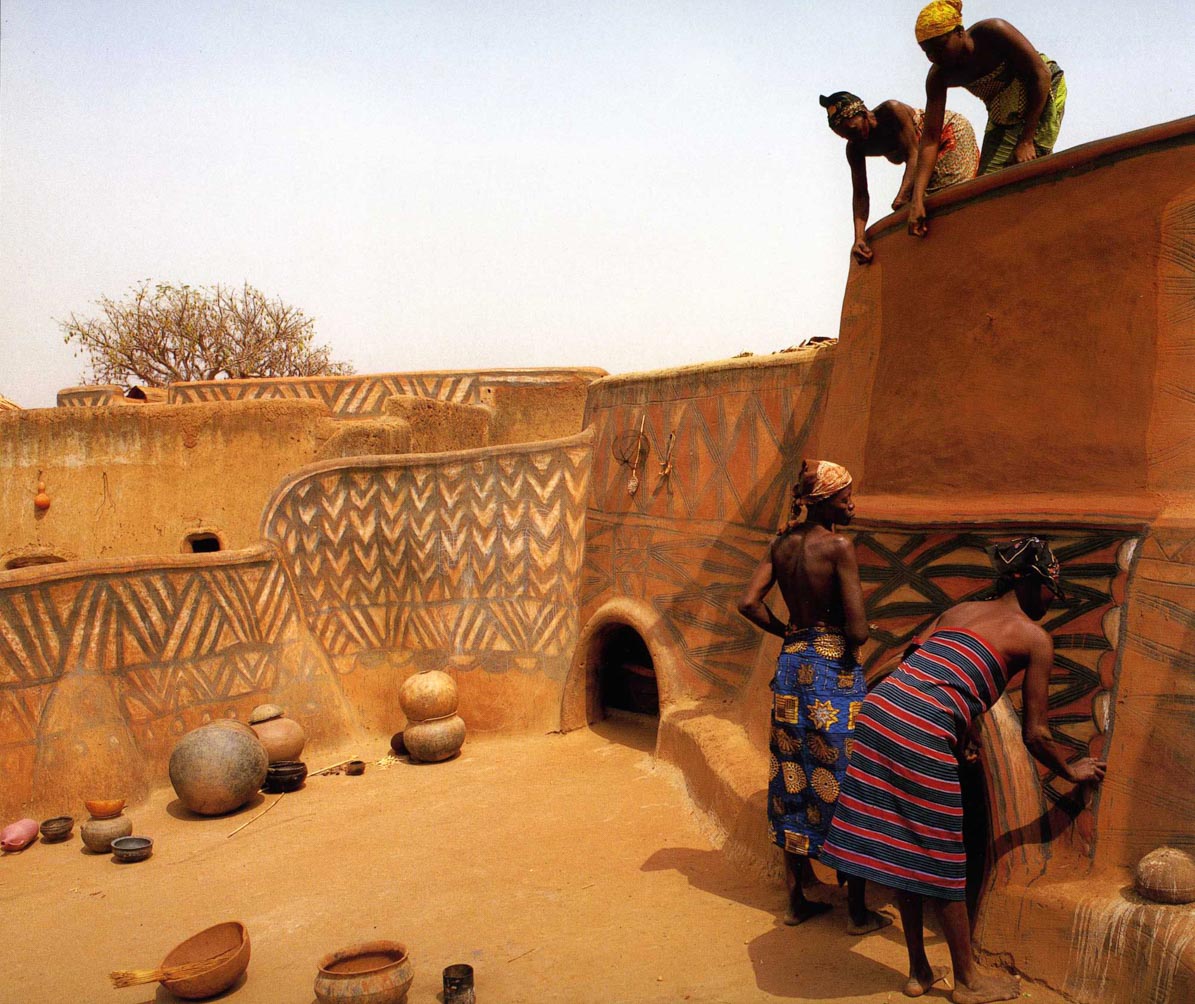
warm

cold
Colour – texture – surface
Seeing – touching – feeling
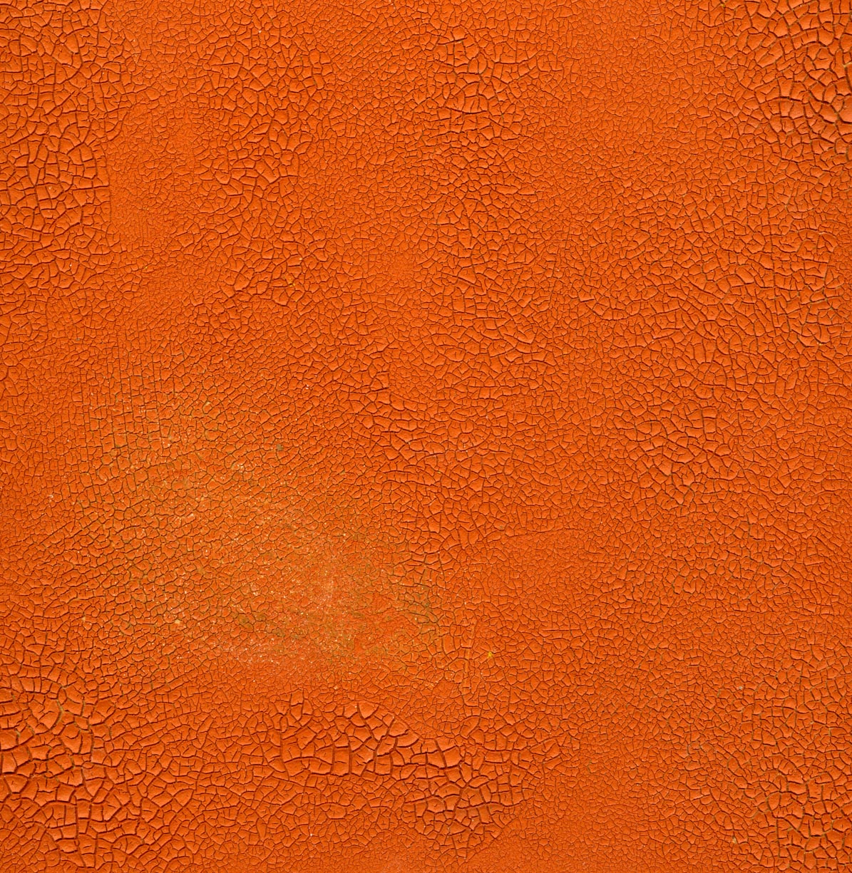
rough
Anyone who believes that two buckets of red and blue emulsion paint are the Holy Grail is mistaken. The character of the surface also matters, supplementing purely visual perception with the sense of touch. Even imagining how an uneven or smooth surface might feel already evokes an emotion.
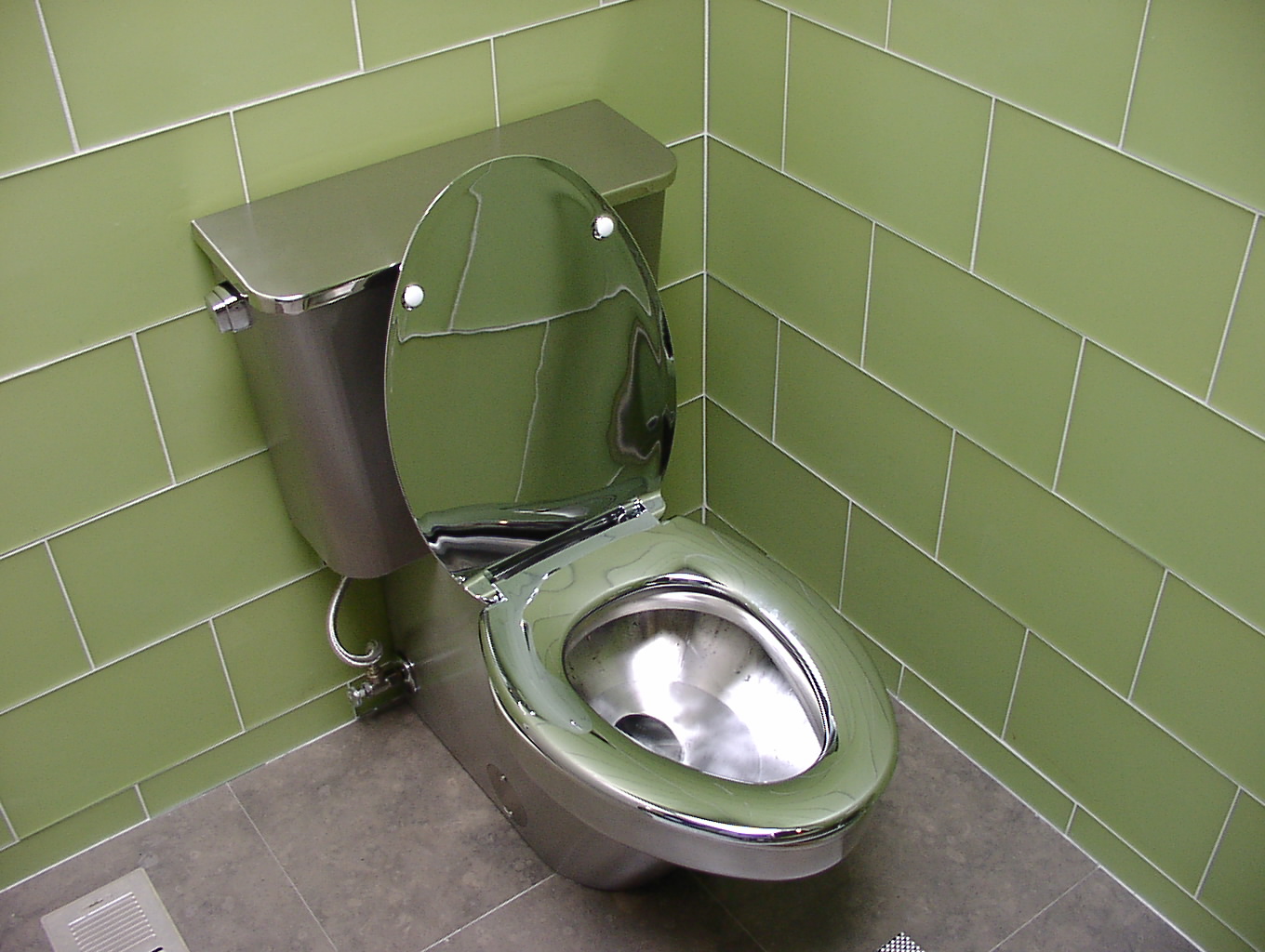
Cold bottom?
Looking with your paws is forbidden!
From childhood onwards, we see with our fingers.
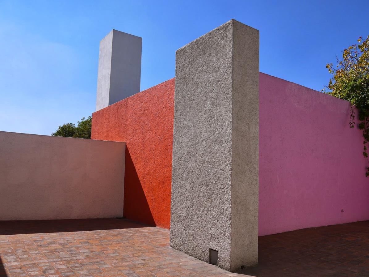
Luis Barragán, Casa Barragán, 1947
The work of the Mexican architect demonstrates this interplay of light, shadow, colour, texture and space particularly beautifully.
Colour combinations
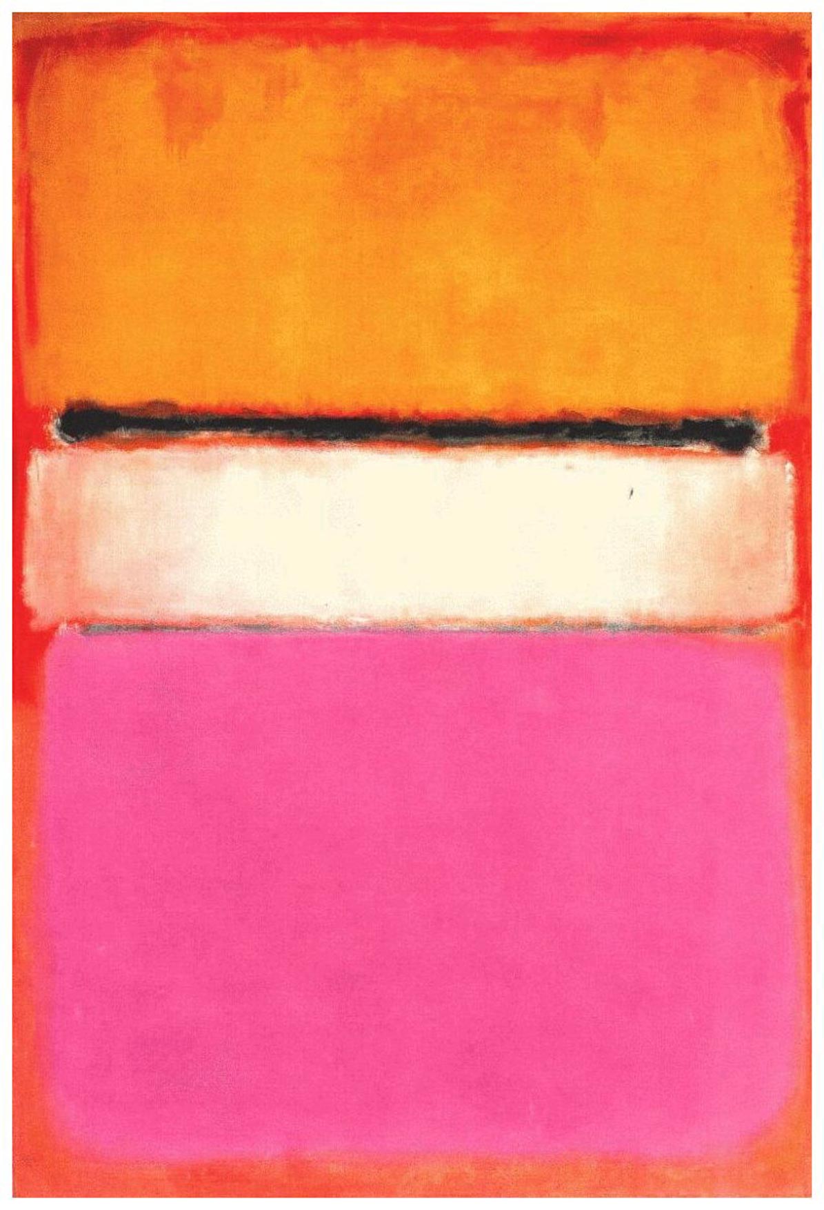
Mark Rothko, White Center, 1950, $73 million
“How could he, with this palette of
hot and cold,
light and dark,
glossy and matt,
radiant and subdued,
joyful and sorrowful,
calm and passionate colours,
elicit emotions capable of reflecting
the breadth, variety, drama, depth and range
of the symphonic music he loved so deeply?”
Ben Heller on Mark Rothko
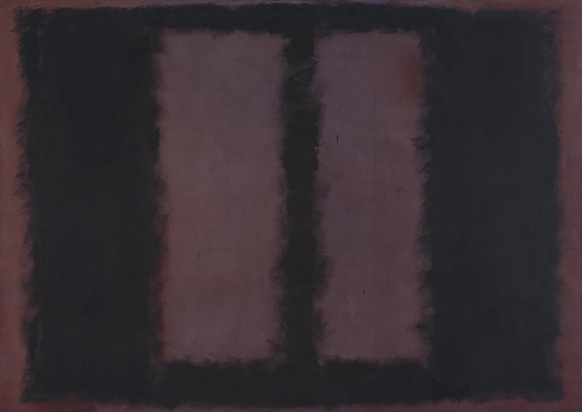
Mark Rothko, Black on Maroon, 1958
One of my absolute favourites and a true master of colour fields was the abstract expressionist Mark Rothko. I am fascinated every time by the way he was able to express joy, heat, pressure or menace. Unfortunately, I lack the spare change for an original.
Theory and practice
A few examples from my projects.

Refreshment – cooling
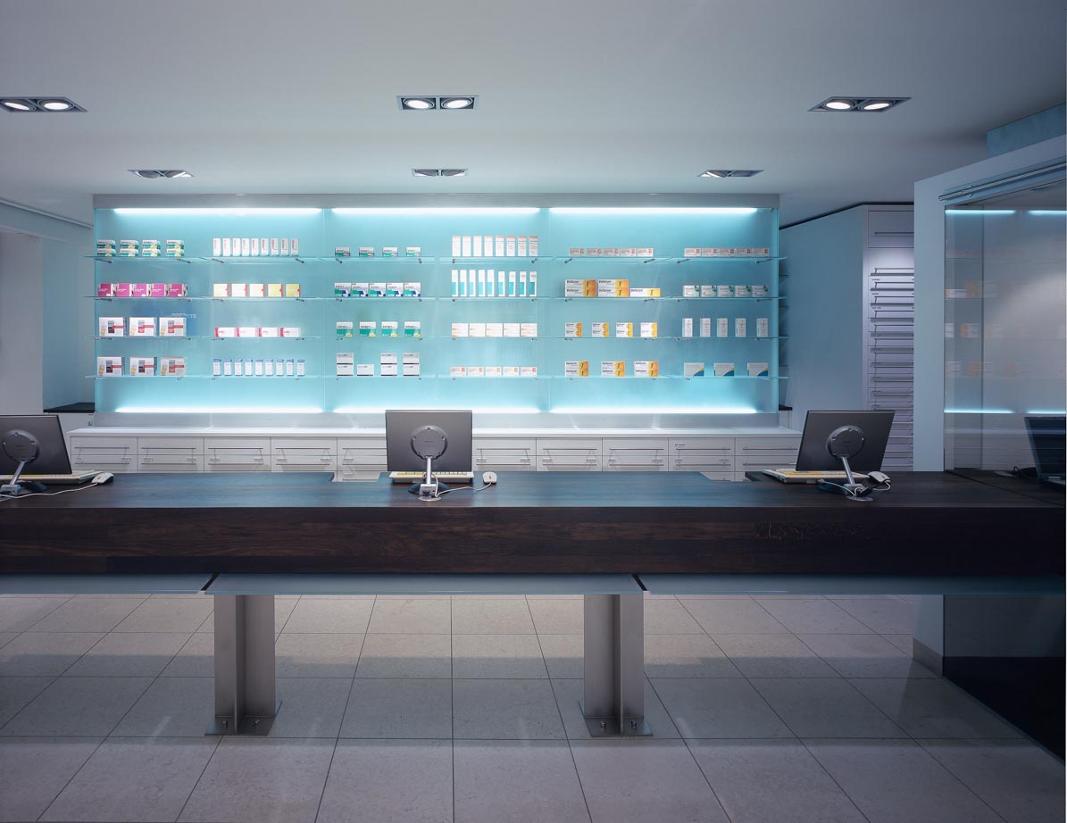
Apotheke am Klemensplatz in Düsseldorf
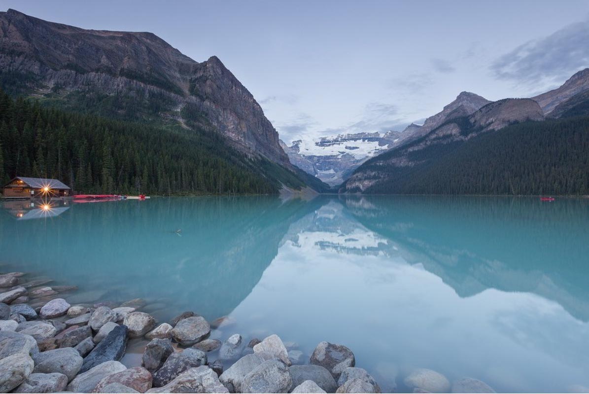
Openness – regional identity
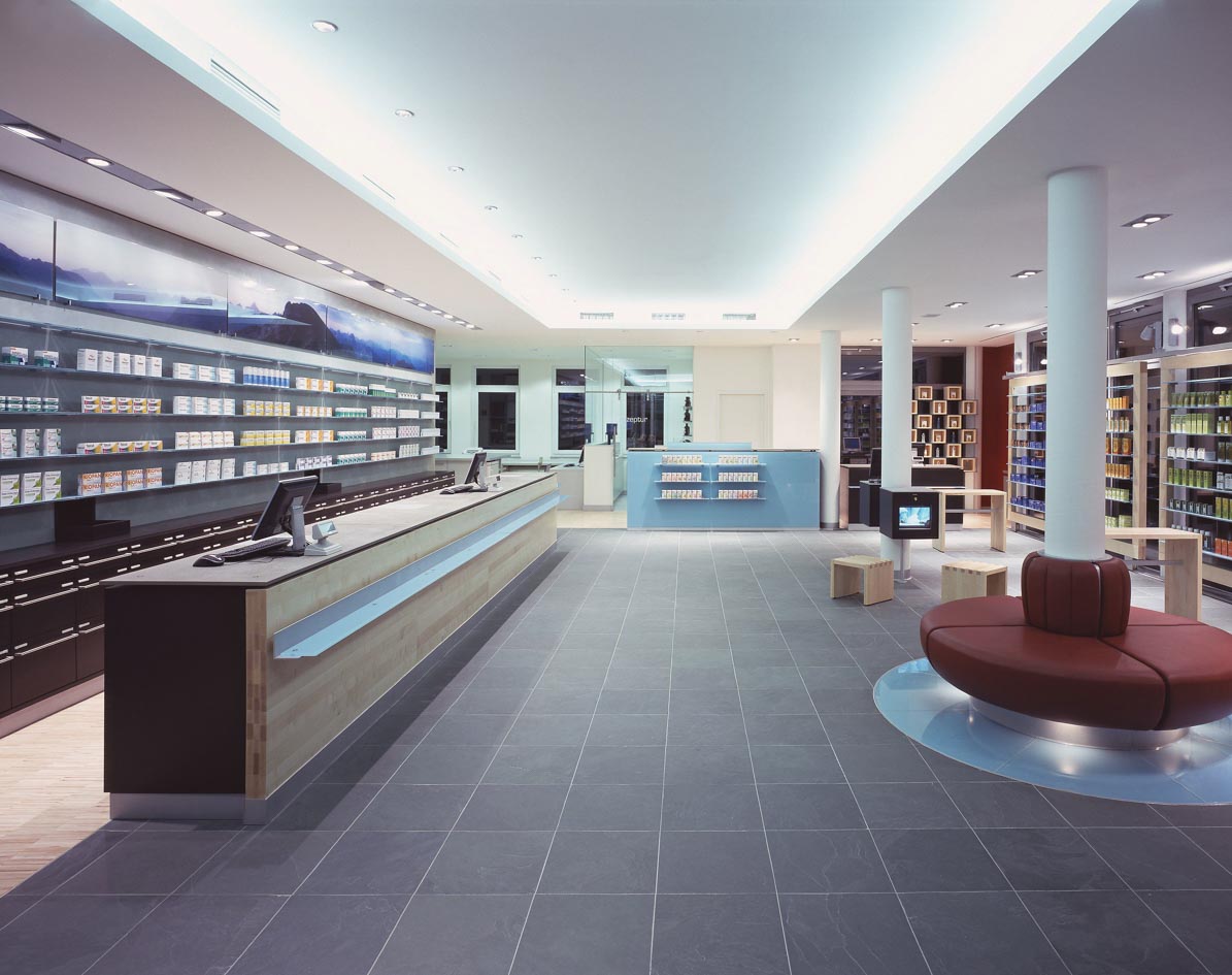
Alpin Pharmacy in Kempten

Warmth – energy
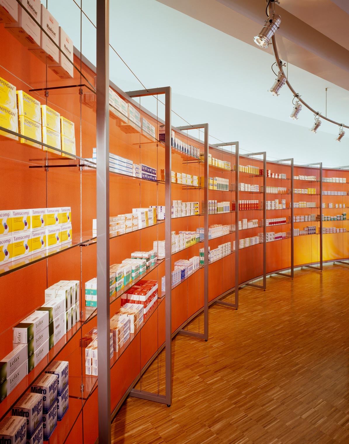
Ohm Pharmacy in Erlangen
A device used in landscape painting is known as aerial perspective:
The greater the distance, the more bluish and cooler the colour appears.

Bryce Canyon, Thor’s Hammer
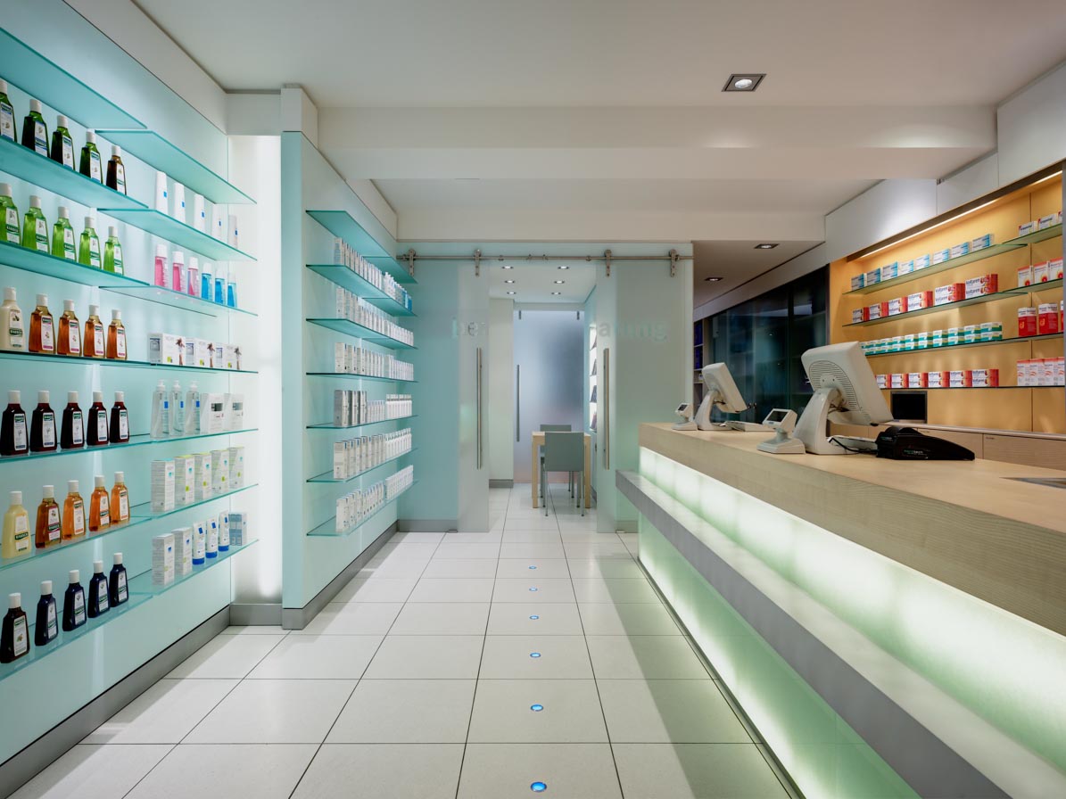
Making small rooms feel spacious.
Fortuna Pharmacy in Düsseldorf
Signal colours
Which brings us back to the woman in red.
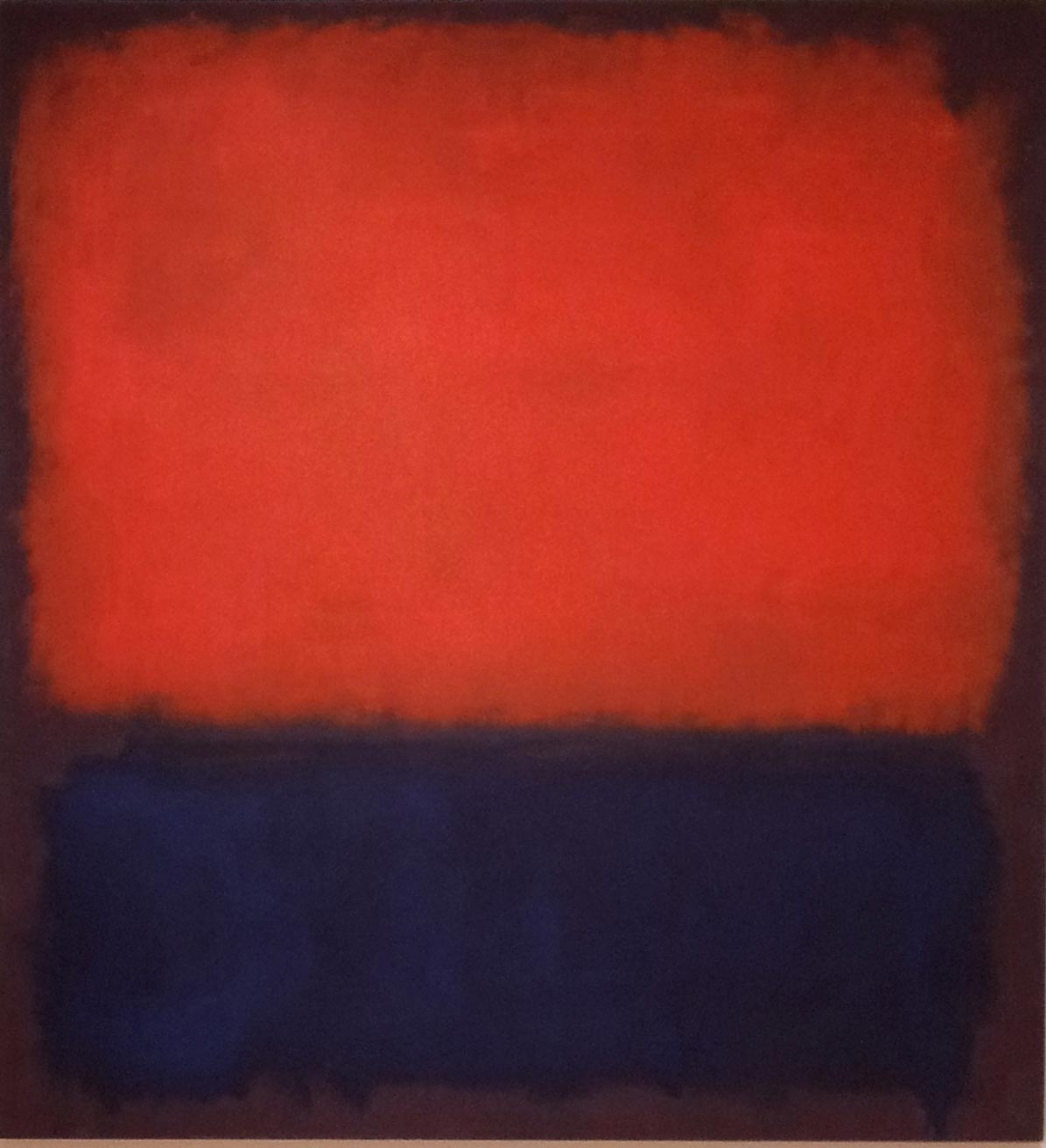
Mark Rothko, No. 14, 1960
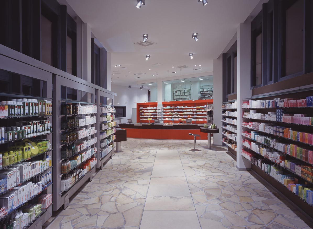
Schiller Pharmacy in Heidenheim

Black and yellow, a sign of danger.
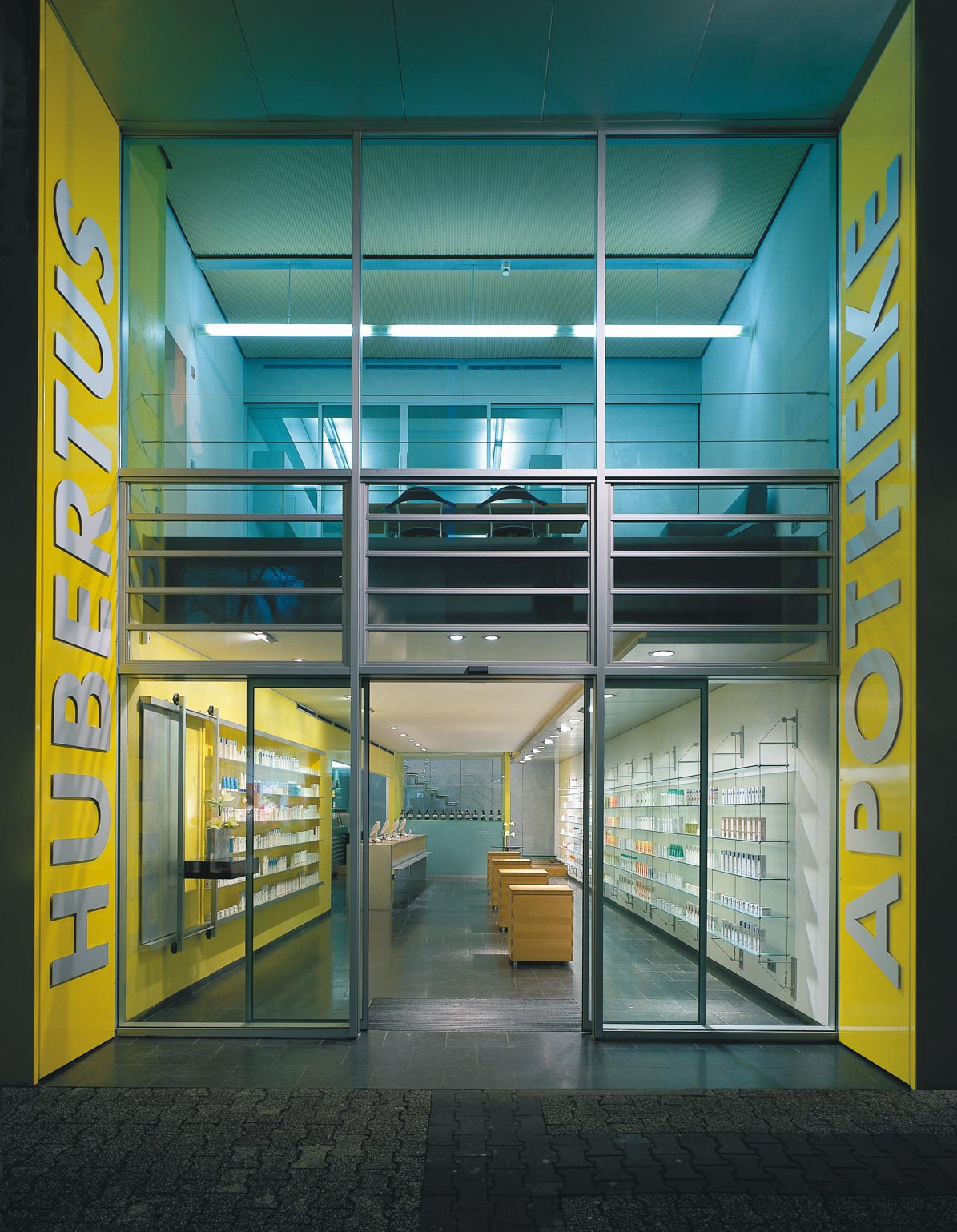
Hubertus Pharmacy in Limburg
From nature
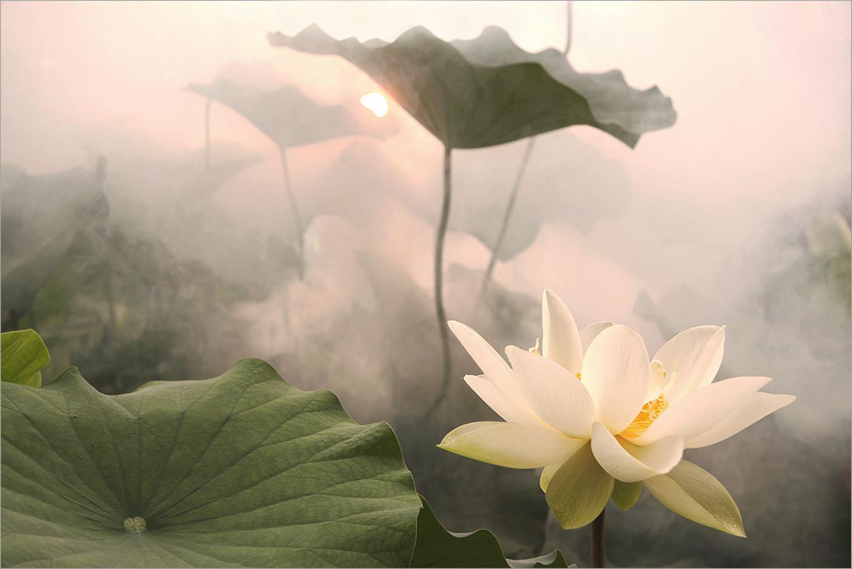
Lotus
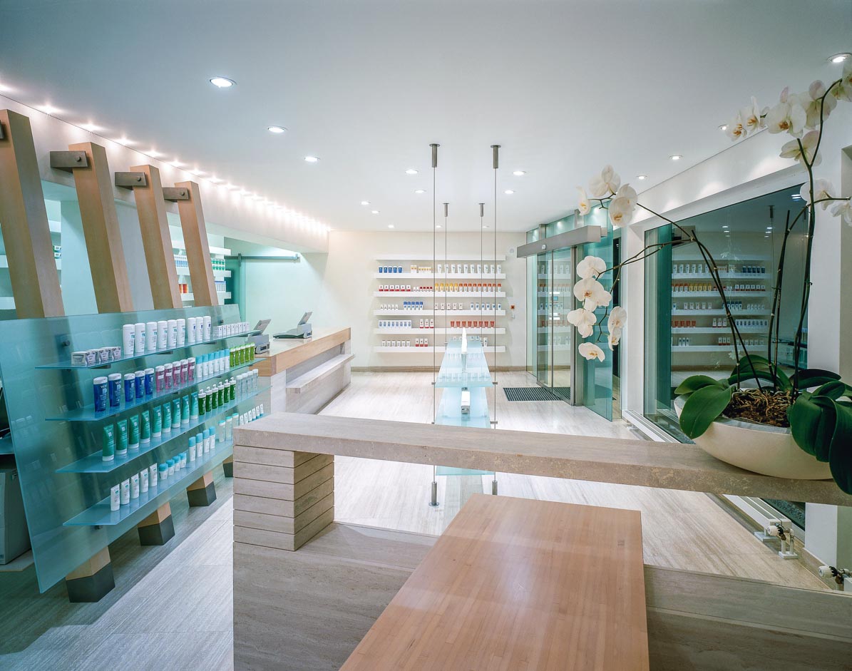
Hardt Pharmacy in Hambrücken

Arnica
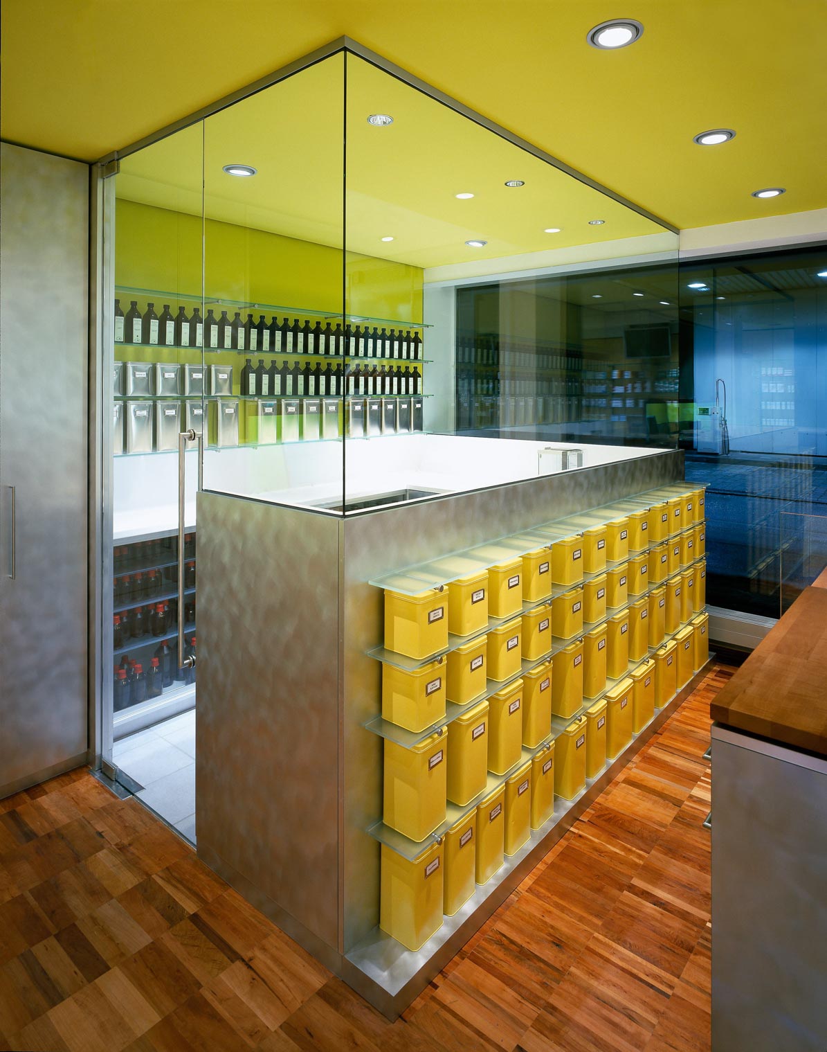
Arnica Pharmacy in Marktoberdorf
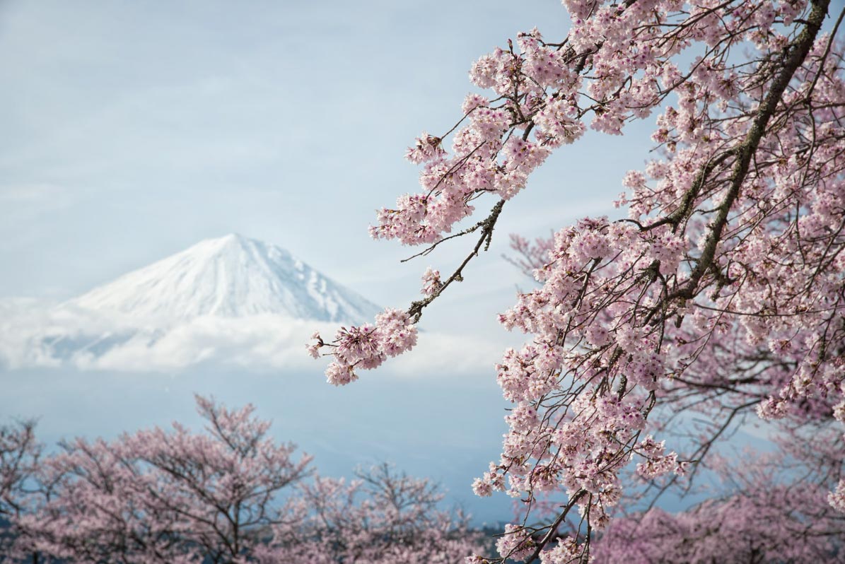
Cherry blossom at Mount Fuji, Japan
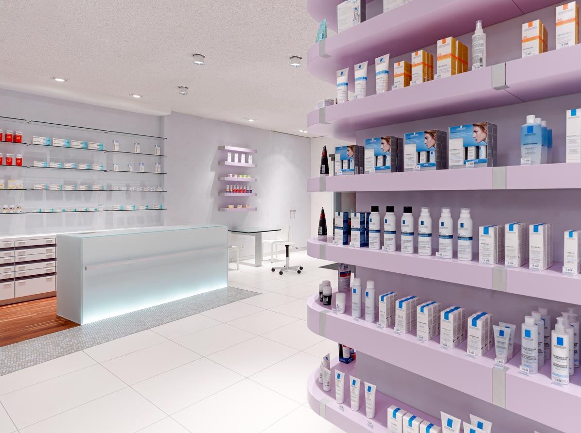
Saale Clinic Pharmacy in Halle an der Saale
Health
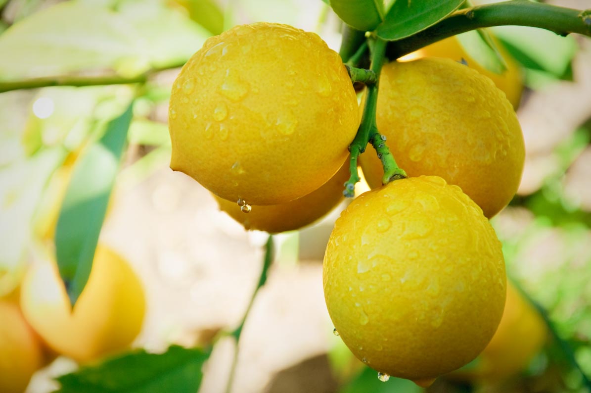
Lemons – vitamin C
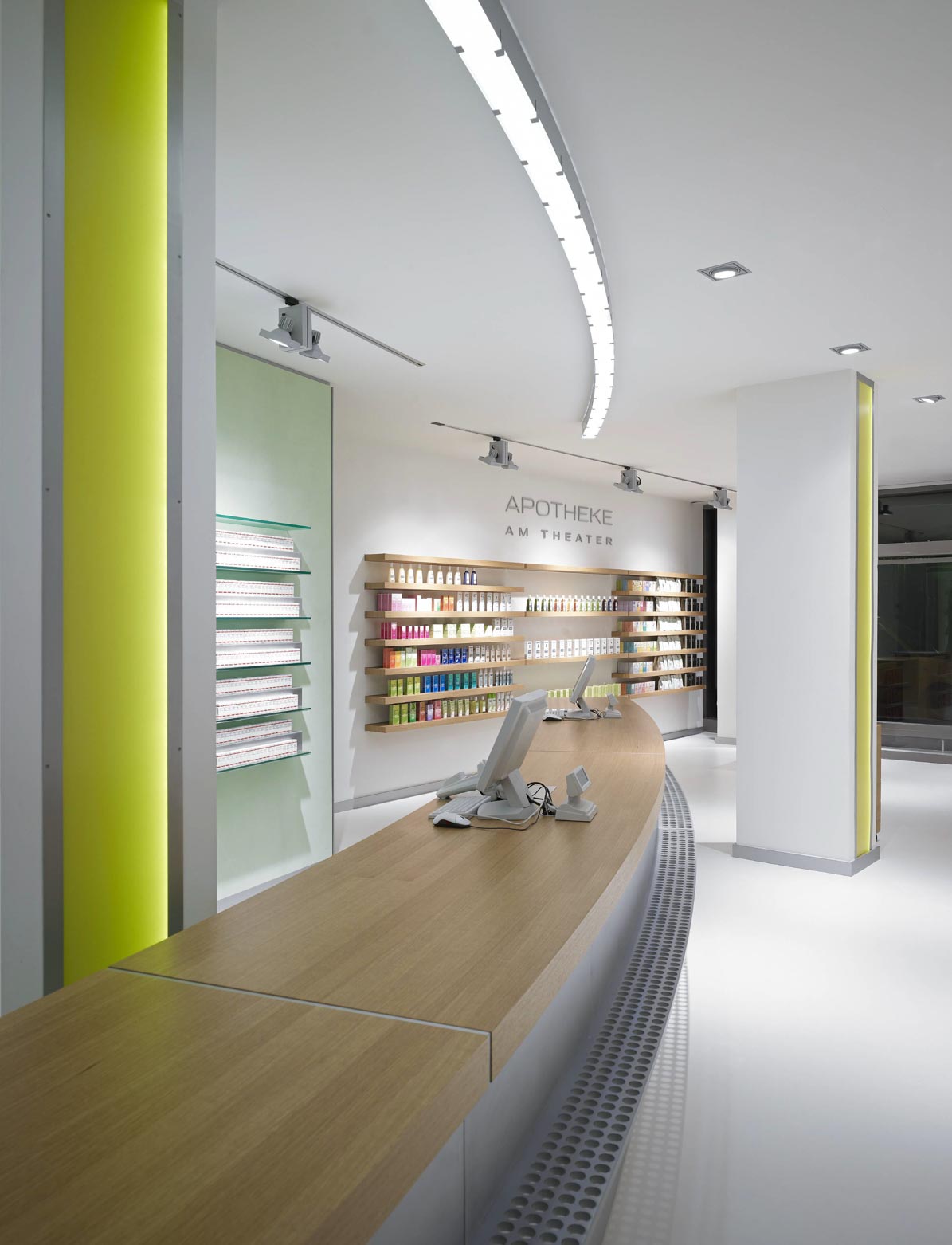
Apotheke am Theater in Esslingen
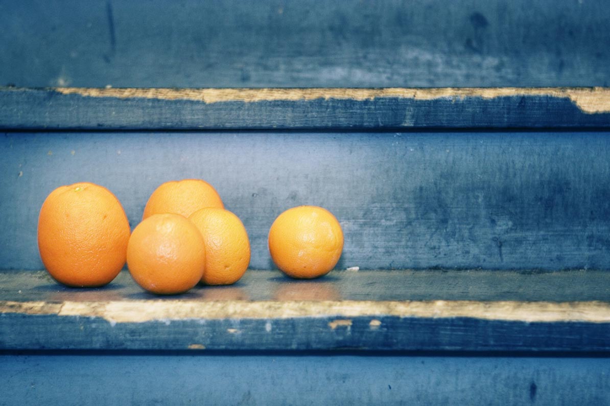
Oranges
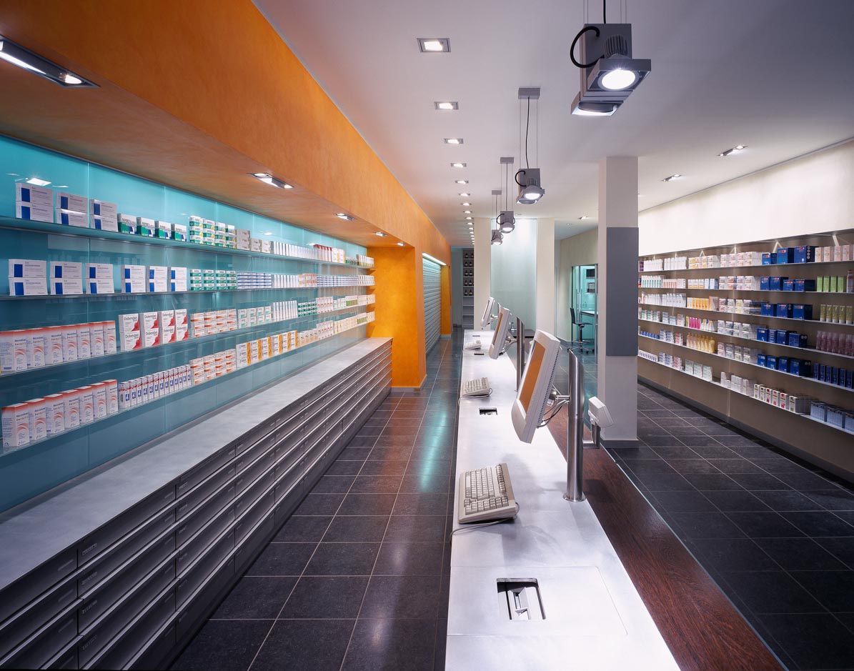
Allmann Pharmacy in Biberach
Poison mixers and alchemy
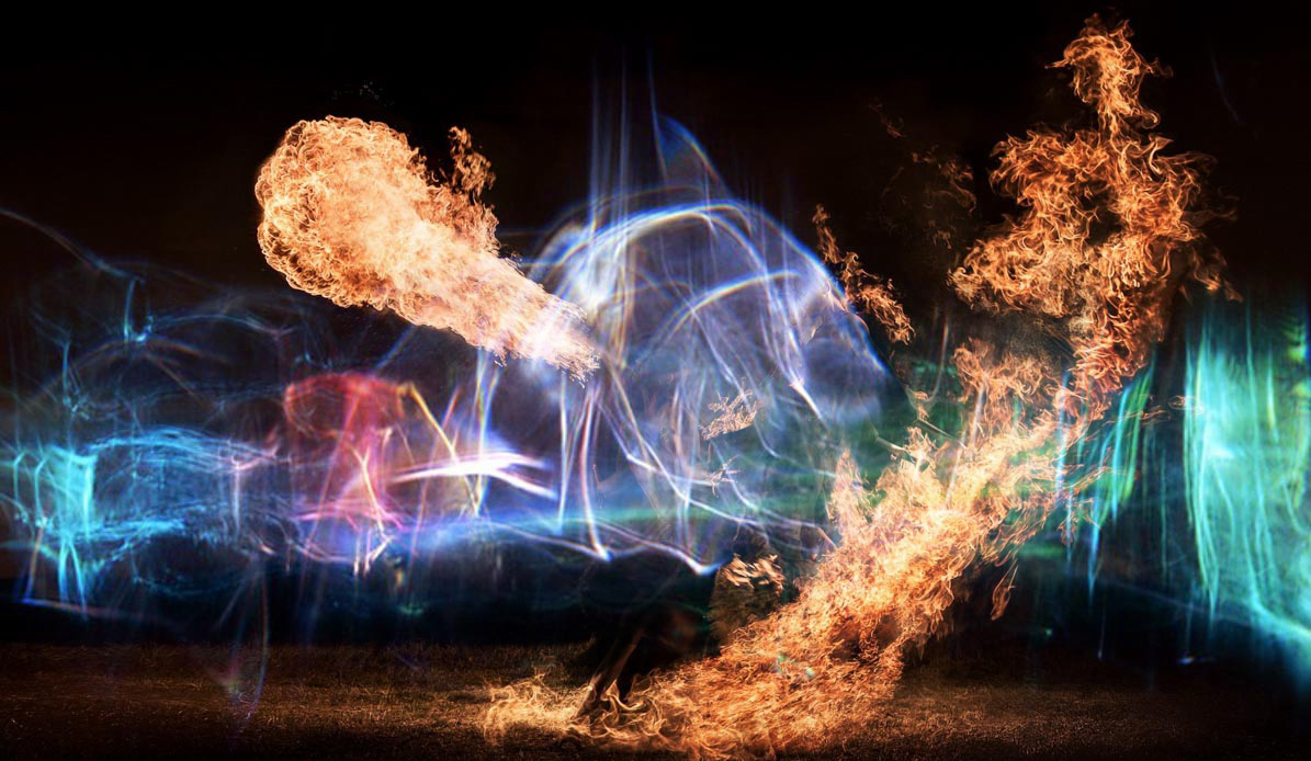
With a “puff” and a “bang”!
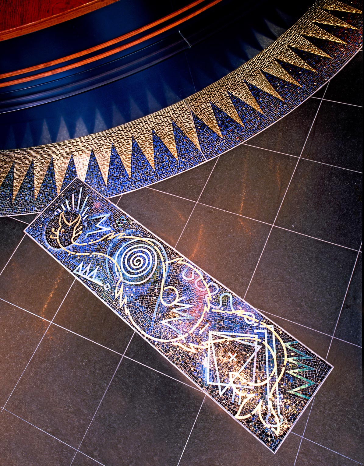
Old Heslach Pharmacy in Stuttgart
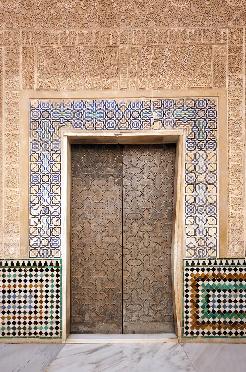
“… As I passed through a narrow and dark tunnel in the Alhambra, the magnificent Court of the Myrtles suddenly opened before me, serene and silent.
It contained everything a cheerful garden should contain: nothing less than the entire universe.”
Luis Barragán
About us
Ideally, everything with which we engage deeply in life has something to do with sensuality. We may be trained cabinetmakers and graduate engineers, yet even mathematics contains a deeper aesthetic beyond the mere addition of numbers.
Those who move beyond this circle of banality in their work attain true mastery and make the world a more worthwhile place in which to live.
Why spend your life in a place you do not love?
Call us: 0 21 51 – 73 60 05