DocMorris Pharmacy
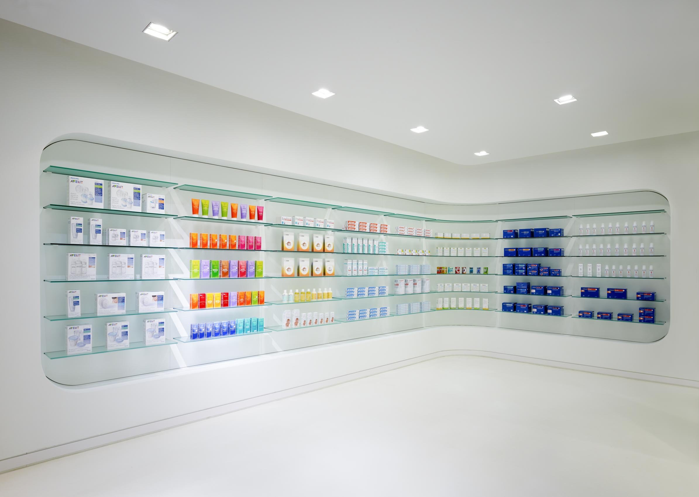
Rethinking a Brand
When Pia and Adolf Wuth planned their new pharmacy in Limburg in 2008, the DocMorris brand already came with a complete shopfitting concept. Colours, furniture and fittings could simply have been ordered from a catalogue.
That was exactly what none of us wanted.
The existing shopfitting system was never intended to become the basis of the design.
Instead we asked ourselves:
Which elements are truly essential to the identity of DocMorris?
The more closely we examined the brand, the clearer it became that surprisingly few elements were indispensable. The characteristic rounded forms, the green-and-white colour palette and the graphic identity defined the framework. Everything else could be reimagined.
We therefore began by designing a pharmacy—its workflows, logistics and spatial organisation. Only afterwards did we translate the visual language of DocMorris into this architecture.
During the design process we described the desired atmosphere with an unusual image:
A menthol sweet with a eucalyptus centre.
A space that feels fresh, light and centred around an intensely green core.
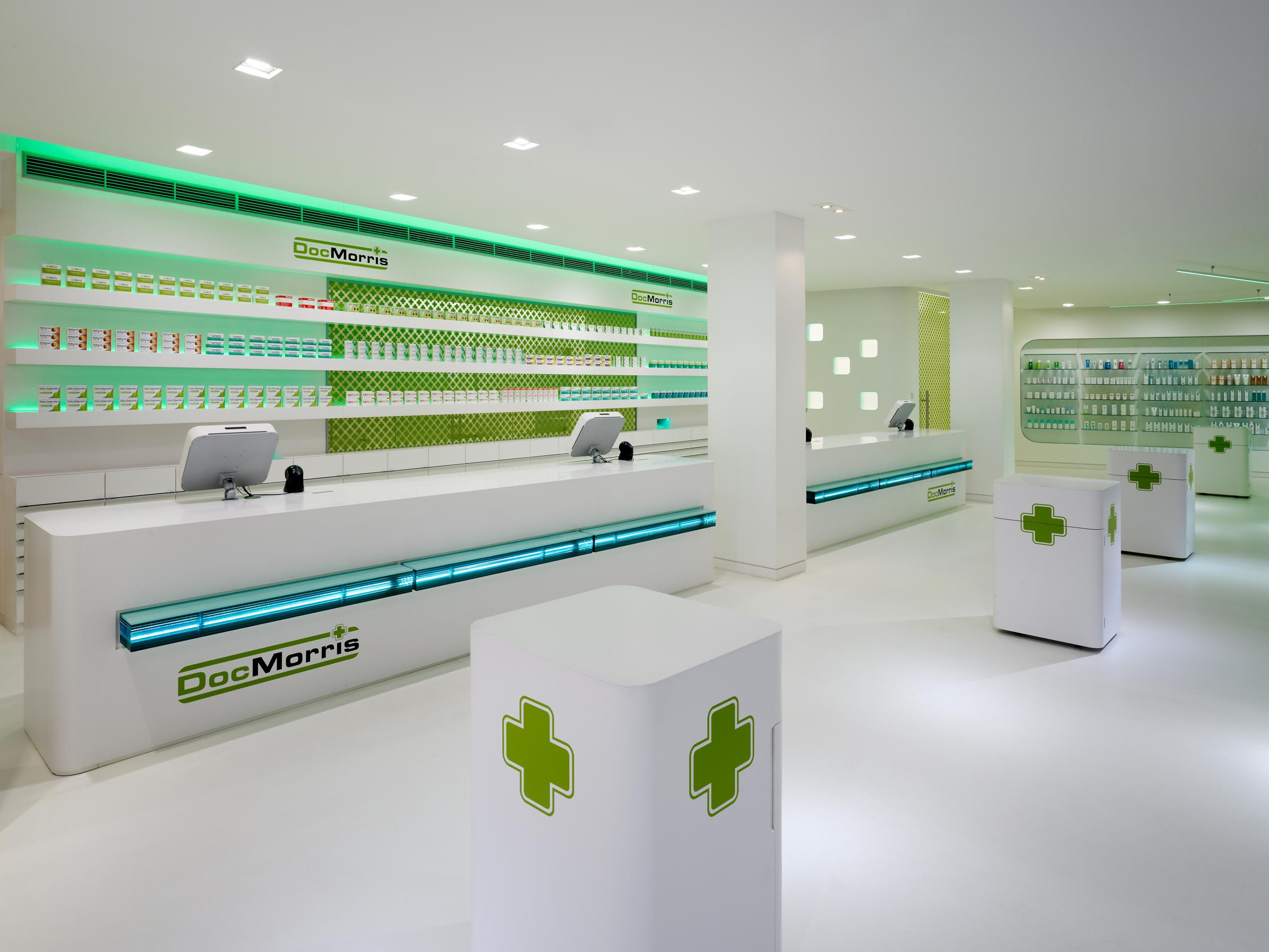
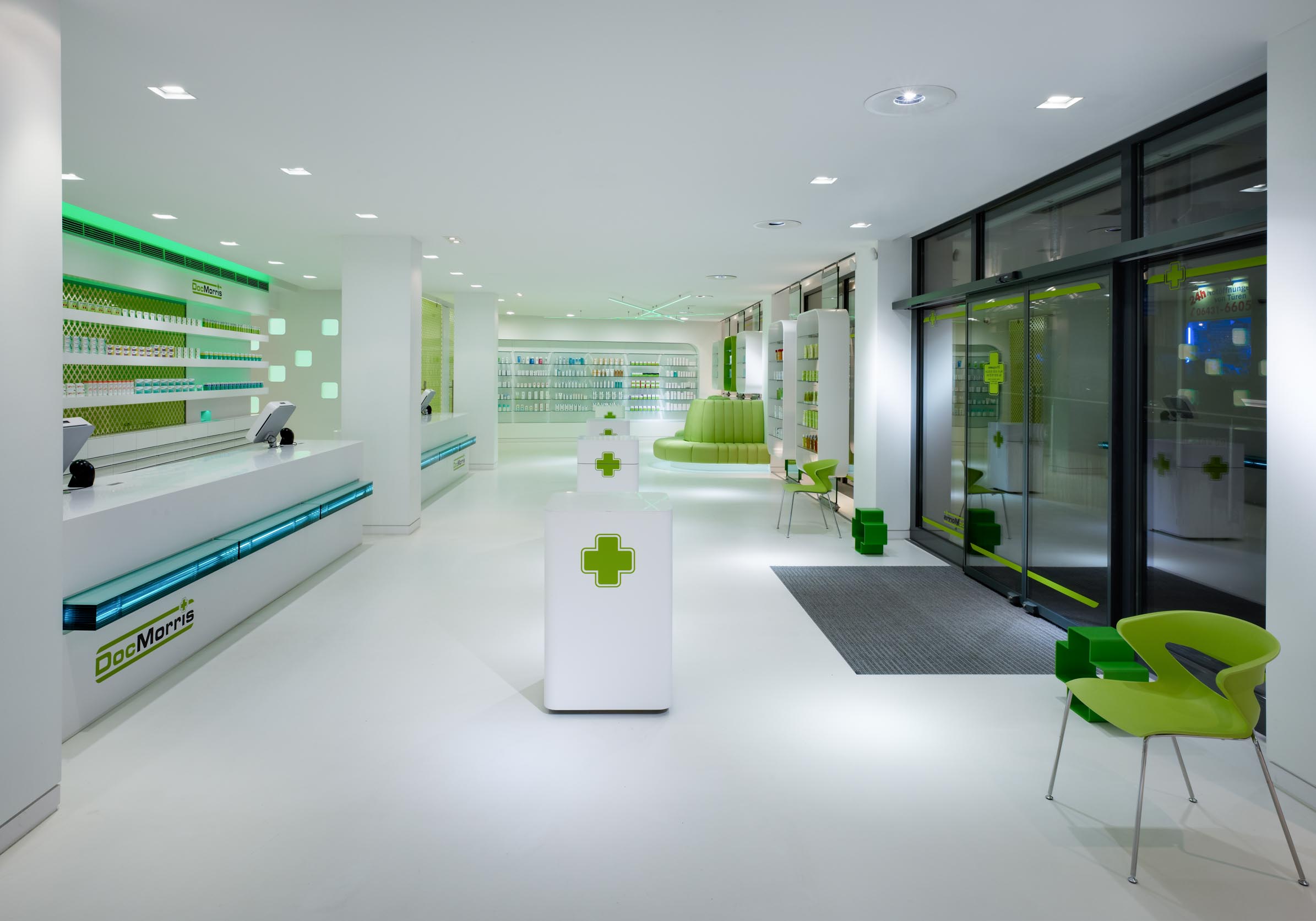
Visitors entering the pharmacy first experience a bright and tranquil interior. White dominates the architecture. The brand’s green appears only where orientation is required or a specific function is highlighted. As a result, the colour never feels decorative but always intentional.
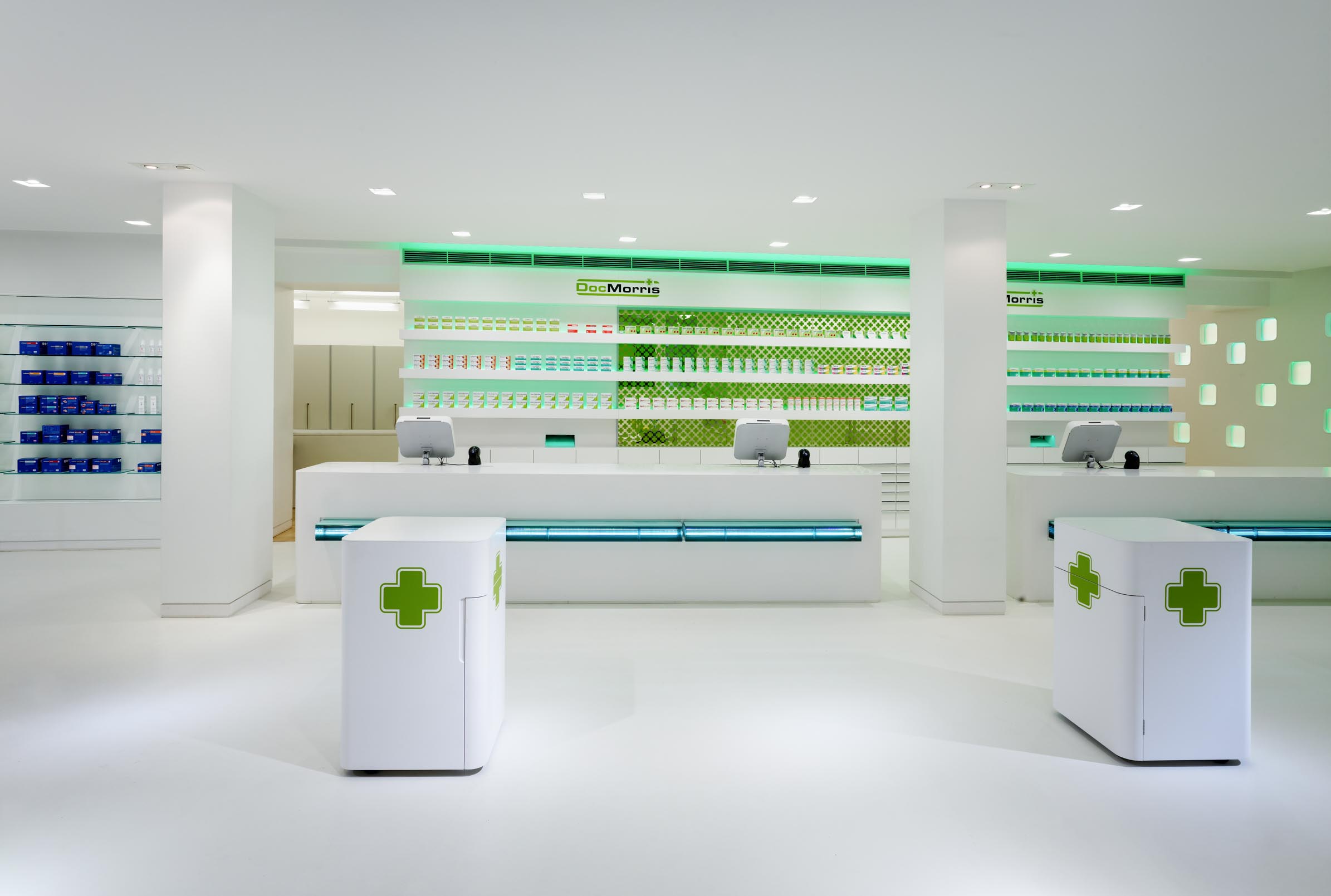
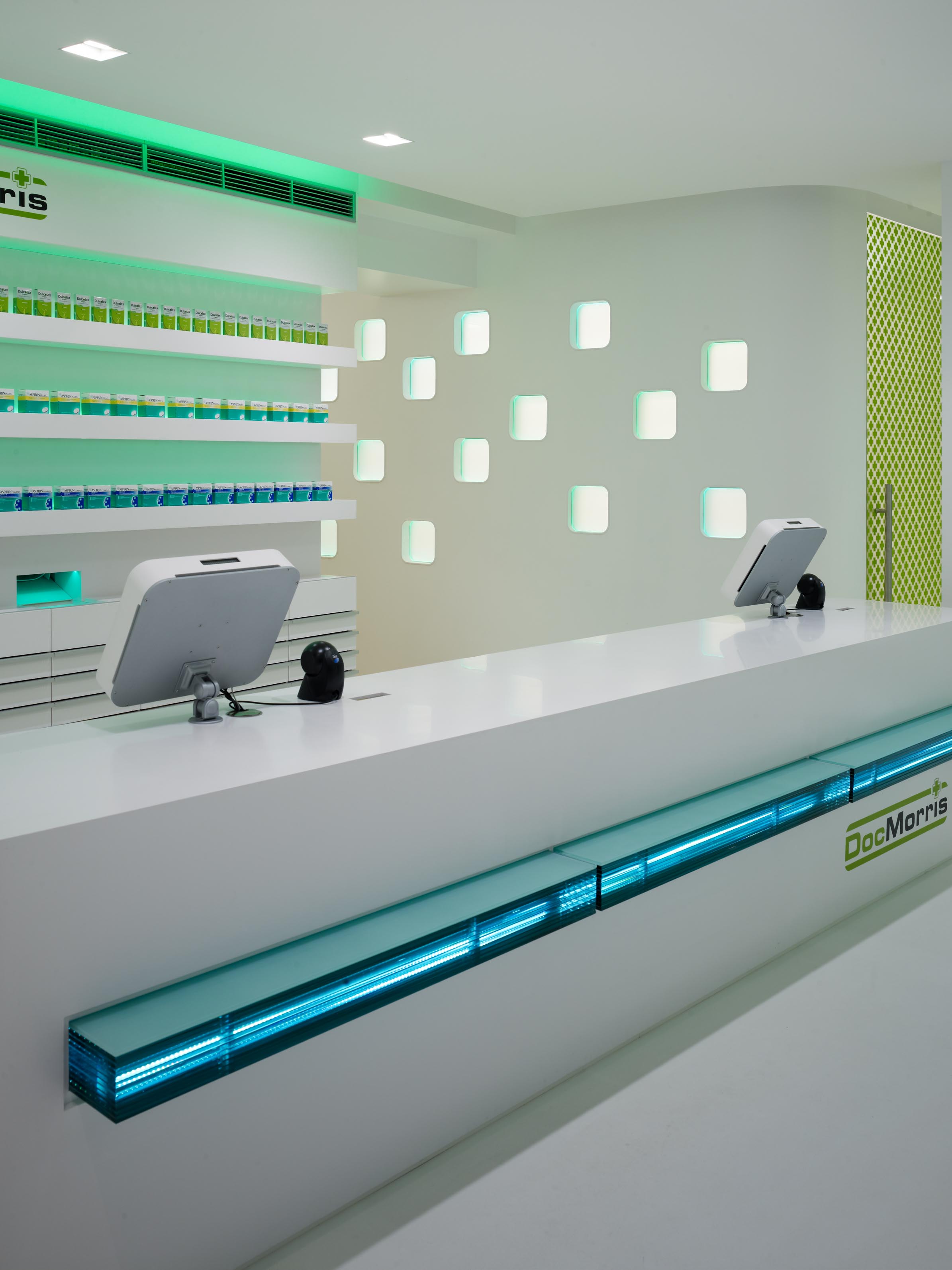
The dispensary extends across the entire width of the shopfront. Behind it lies a second functional band containing the complete working area with laboratory, office, staff facilities, goods handling and storage technology. This clear separation creates efficient workflows while keeping technical processes out of the customers’ view.
One of the key requirements was the storage robot. At over nine metres in length and extending from floor to ceiling, it could not simply be placed anywhere. We therefore searched for a location where as little valuable floor space as possible would be lost. The solution was the section of façade where the traditional shop window function could be replaced by other uses. This area now accommodates both the night-delivery facility and the integrated emergency-service counter. A single section of façade therefore fulfils several functions while leaving the main shopfront entirely available for the dispensary.
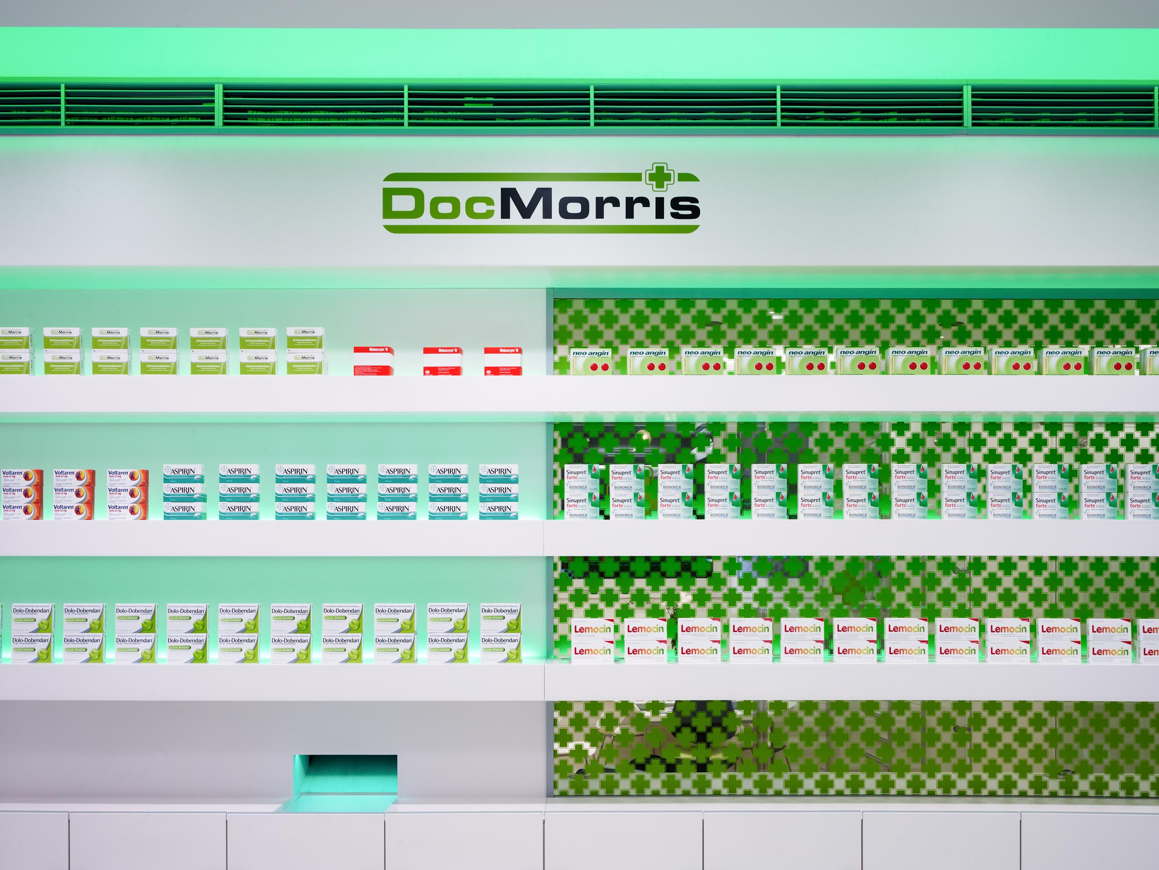
The medicine display forms the only deliberately orthogonal element and creates a calm counterpoint to the soft curves of the remaining design. Its geometry immediately distinguishes it from the self-service shelving. The drawers contain the medicines required most frequently, while all other products are delivered automatically from the storage robot to the dispensing points.
DocMorris green appears not only as a material colour but also as light. RGB LEDs introduce carefully positioned green accents within the medicine display and consultation rooms. The result is the impression of a white architecture surrounding an intensely green centre.
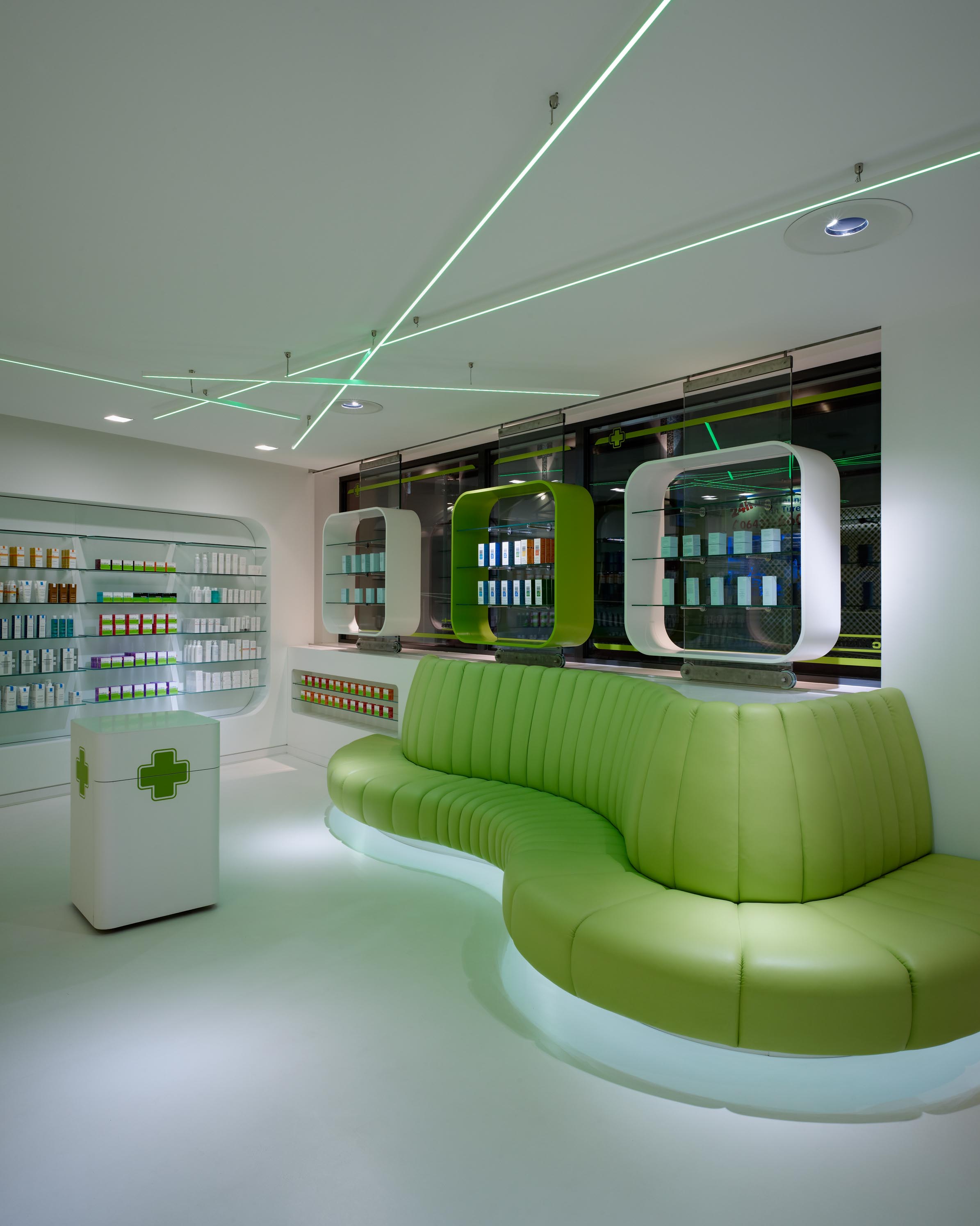
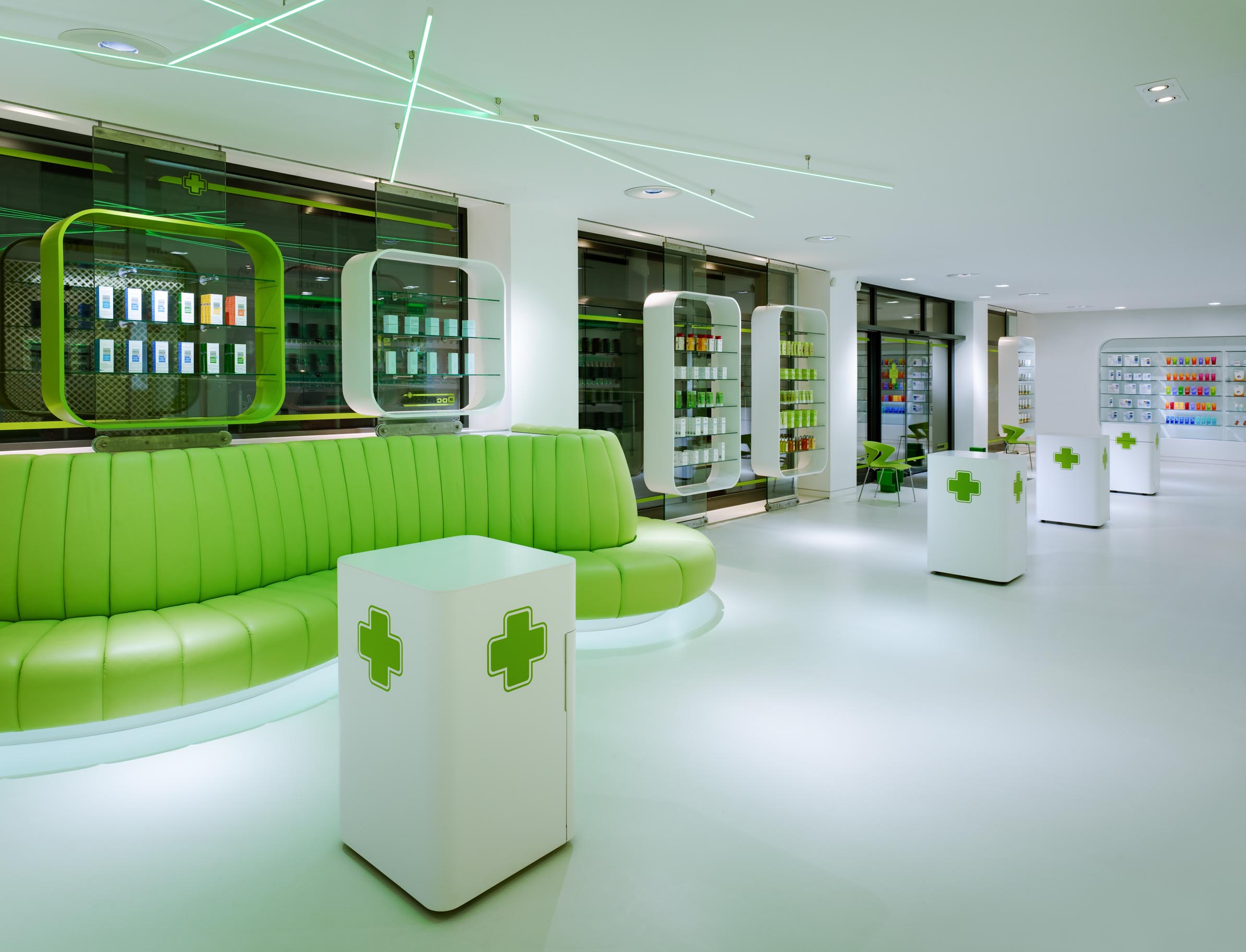
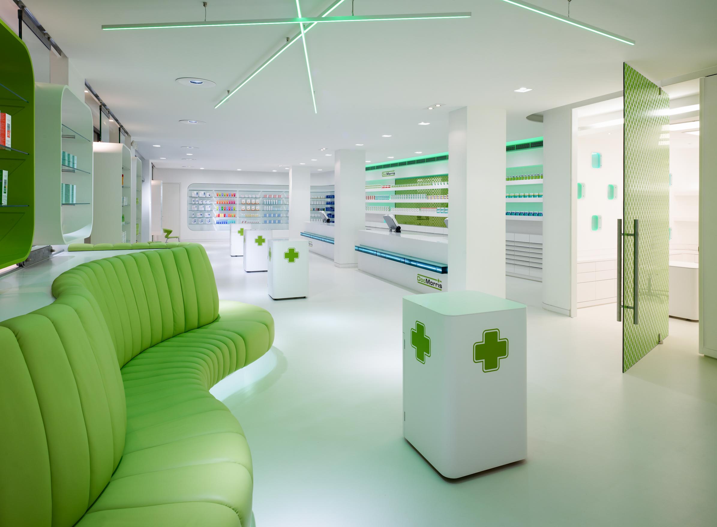
The six-metre-long leather sofa defines the waiting area. It winds through the otherwise clearly structured space like a gentle wave, providing an intentionally organic contrast to the orthogonal layout of the dispensary. Above it, a suspended lighting sculpture completes the spatial composition.
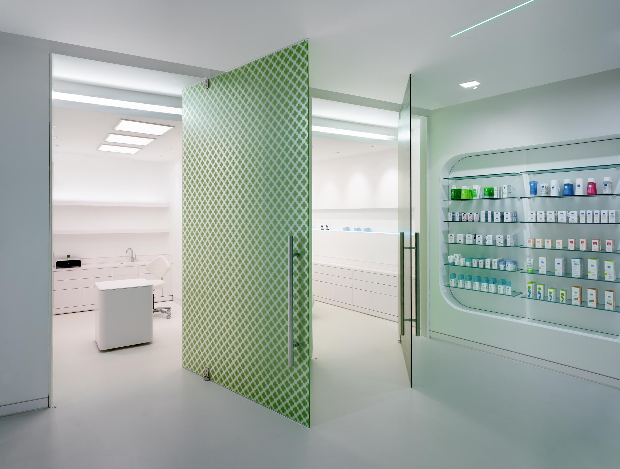
The two consultation and cosmetics rooms are enclosed by glass doors almost three metres high. Their graphic film was designed specifically for this project using a pattern of small DocMorris crosses. Here too, the corporate identity is interpreted architecturally rather than merely reproduced.
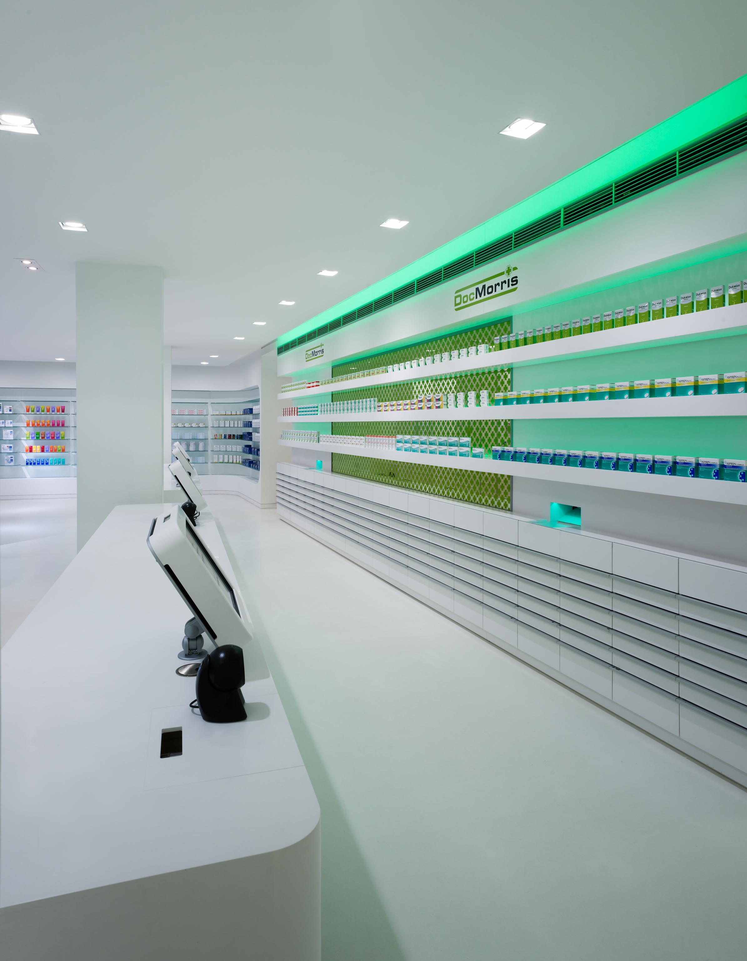
Even the working area remains part of the architectural concept. Through the glazed rear wall of the medicine display, staff retain visual contact with the sales floor while daylight reaches deep into the rear sections of the pharmacy.
Many functional details were developed specifically for this project. The prescription counters were manufactured seamlessly from white Corian. Illuminated glass blocks serve as handbag shelves. Even the touchscreen housings for the checkout systems were custom-designed. Mobile promotional display cubes combine product presentation with additional drawer storage. A lower version can be rolled directly to the green waiting sofa and used as a mobile blood pressure and blood glucose testing station.
The movable display units keep the shop windows transparent and flexible. They present products without obstructing views into the pharmacy, allowing the openness of the space to be experienced even from outside.
During the design process another question occupied our thoughts.
What happens if the brand no longer exists one day?
For this reason we advised the clients not to make the architecture entirely dependent on DocMorris. Logos, graphics and lighting colours should remain easy to replace, while the spatial quality itself should endure.
That is exactly what happened.
Only a few years later, DocMorris largely withdrew from the stationary pharmacy business. The pharmacy received a new name. The DocMorris Pharmacy became the Green Pharmacy. The architecture remained almost unchanged. Logos were replaced, graphics removed and even the lighting colour could have been adjusted. The design continued to function because it had never relied on a shopfitting system, but on a spatial idea.
In 2014 the project received a German Design Award – Special Mention. The jury recognised the independent architectural interpretation of the corporate identity and the consistent design of a pharmacy that went far beyond the usual requirements of a franchise concept.
Further information

More projects, detailed photographs and references relating to pharmacy design can be found on our Pinterest board:
Pinterest board “Pharmacy Design”
Project details
- Project: DocMorris Pharmacy (today: Green Pharmacy)
- Location: Diezer Straße 13, 65549 Limburg an der Lahn, Germany
- Completion: 2008
- Total area: 279 m²
- Client: Pia and Adolf Wuth
- Services: Interior architecture, pharmacy planning
- Award: German Design Award 2014 – Special Mention
- Special features: Complete reinterpretation of the corporate identity, custom-made furniture, Corian prescription counters, RGB lighting concept, storage robot and biodynamic lighting for the consultation rooms
We do not plan pharmacies. We create one-of-a-kind spaces.
Every project has its own story, its own requirements and its own personality. That is why we do not believe in standard solutions.
Should you wish to discuss your own project, we would be delighted to hear from you.
Phone: 02151 736005
Email: k.buerger@k-buerger.de